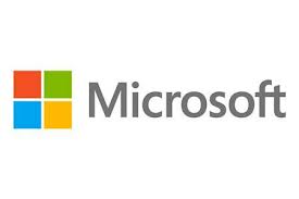
 To gear up for new technological advances, like the rollout of Windows 8, Microsoft recently unveiled their new logo. The MS logo, which hadn’t been changed in 25 years, is designed with a multi-colored square alongside the company name in plain text. The new logo is part of Microsofts’ introductino of several new products: Windows 8 operating system, Office, and phone software. The company’s hope is that the new logo will create an unique and memorable version of the “customer experience”.
“It’s been 25 years since we’ve updated the Microsoft logo and now is the perfect time for a change,” said Jeff Hansen, general manager of Microsoft’s brand strategy, in a blog on Microsoft’s website. “This wave of new releases is not only a reimagining of our most popular products, but also represents a new era for Microsoft, so our logo should evolve to visually accentuate this new beginning.”
The new logo is already in use at their corporate offices and was unveiled at a new store in Boston.


