What are the some of the most memorable company logos you’ve ever seen? Coca Cola, Apple, Home Depot, McDonald’s, etc easily comes to mind. What make these particular logos considered some of the best though? Well, they are simple for one. The designs are clean and easy to read/see. They aren’t congested with a bunch of colors and crazy shapes. These reasons plus others all justify why these companies have seen longevity in public presence. People quickly identify with the trademarks. You can travel anywhere in the world and recognize what company it is just by seeing their logo. So for a business owner, music label owner, etc brainstorming on a new logo to represent their company can be tedious. But it doesn’t have to be.
Before you sit down with a graphic designer or illustrator, write down your mission and vision for the company. Your mission will summarize what services, products, and vision your company will present to the world. In that mission, there may be words that could help you generate initial ideas as to what your vision should visually look like. Once you have a clear and concise idea of what your logo should project, take your ideas to the graphic designer so that they can start the process of creating your logo.
In case you need additional advice on how to create the best logo for your business, here are few key ways to help you with the process:
1. Keep It Simple
The more colors you use in a logo, the harder it will be for the public to enjoy looking at it. Congestion is comparable to complexity. No one enjoys having to think to hard. So, keep your logo design simple. Use only one to three colors. Certain colors like grey or pale green give off a calmness. If you opening a spa or beauty salon, you may want to use these colors in the name or overall design.
2. Keep Your Brand Consistent
Once your logo is complete and ready to go public, be consistent in how you market it. Use the same logo on all branding materials (i.e. t-shirts, hats, pens, flyers, email blasts, etc). Your logo should not change from one branding strategy to the next. If it does, it will cause major confusion to the consumer.
3. Make Sure Your Logo Is Memorable
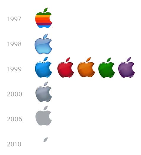
The idea is the make your logo something that the public remembers. If a person were to flip through a magazine and come to a page with a simple apple on a plain white page, he or she will turn to the next page and think nothing else of it. But displaying an apple that has a bite taken out of it (“Apple”), the bite mark is what make the logo memorable. The mark also make the public quickly identify what company it is and what that company sells.
4. Make The Public Talk
If you are a risk taker and a little bit more avant garde with your approach, you may choose to be more creative with your logo. At the end of the day, your goal is to make the public talk about your logo. Who wouldn’t want their logo be the next water cooler topic? If so, sit down with your graphics guy and figure out how you can plug in a little excitement or weirdness into the design.
5. Test The Market
The best way to see if your logo works is to test it out in the market. Use focus groups, online surveys, local mixers to present the new logo and get instant feedback. The feedback or suggestions you receive may ultimately help you revise what you have and come up with a final design that will best represent your company.
All the information listed above will help you tremendously with designing your new logo. The logo is the most important aspects of your business. Don’t rush to create one. Take your time and think about what it should consist of. What is the message that your logo portrays? What mood does its colors put you in? Is the design itself too crazy or complex? Ask yourself all of these question before finalizing your logo. Logos, in the end, should effectively and efficiently represent the company when there’s no one around to speak for it.


